
Review: Chaos #0
In April 2003, a Polish group called Grape released issue 0 of Chaos, a charts magazine. After unpacking the 400 kb archive and running the Win32 executable, you get to see an excellent title picture by Mantra of Addict; on its loading, an interesting effect is performed: First only a point in the center of the pic is shown, then a circular division the radius of which continously increases until the whole (rectangular) pic becomes visible. At the same time a chip tune starts playing in the background, which sounds nice at the beginning but soon becomes quite a nuisance. Unfortunately (or rather fortunately?) there are no credits, so I am unable to tell you the name of the creator of the tune.
Anyway, the tune doesn't really matter that much since you can easily turn it off, and even if you don't, you won't spend much more than a few minutes with the mag anyway as it's a pure charts magazine - a Polish one on top of that: it's in Polish language and features only Polish charts: "Best Polish diskmag", "Best Polish slideshow", "Best Polish Party" and so on. What's interesting is that they have three categories for GFXers: "Best Polish Graphician", "Best Polish 3d Modeller" and "Best Polish Image-Processing Artist". I wonder what exactly an image-processing artist is - is it someone who modifies scanned images in Photoshop?
Apart from the best-of lists, there is a list of voters (32 people in total, of course all of them from Poland), a message corner (wow, it's been ages since the last time I saw such a thing in a diskmag!), a news corner and the editorial, written by a man with a well-known name: Akira. Akira, who used to be one of the mail-swappers with the most contacts in the world and also edited a big bi-lingual disk magazine, Bad News, in the early 1990s, has recently resumed his activities in the scene. Only a few weeks ago, he also re-joined his old group, Surprise!Productions.
The mag interface is intuitive, though a bit
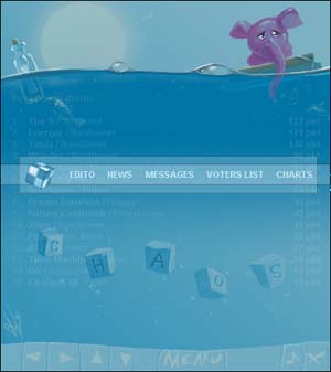
clumsy since you have to use the buttons; keyboard control is not supported. The font is sans-serif, using the colours white, light green, light blue and yellow, and it's well readable in front of the blue-ish, simple but cute background graphics that show a pink elephant doing a boat trip. There are some sweet fading effects that remind me of the old German diskmag Cream. The main menu features a rotating cube and rectangles following the reader's mouse cursor when he rolls over one of the section headers. What's quite funny is that if you've already visited an article, it will not have faded out completely, but the text will still remain on screen, displayed in a colour that differs only little from the blue of the background. On the loading of the main menu, you'll also get to see a quick particles effect. In other words: The visual design of this mag is pretty cool.
So if you have some 400k of bandwidth to waste and have no better idea, feel free to check out Chaos #0 at scene.org. Perhaps you'll also be surprised that even though Unreal is still regarded as the best Polish coder, a demo by Suspend is considered better than any Sunflower production: it's named "The S". Have you already heard about it yet?